| | |

Trying Flexbox at Casabona.Org

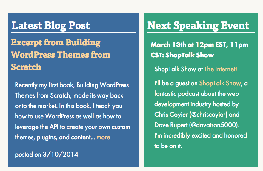
If you’ve visited Casabona.Org this week, you noticed that the homepage got a bit of a refresh; I decided to add more color, have more concise and focus content, and tried to give visitors an idea of what I do as soon as they get to the site. One new thing I tried was using the Flexbox Layout Module to layout the two-column area. Here’s how I’m handling it.

First if you need a primer, @chriscoyier has a fantastic Flexbox Guide on CSS Tricks. It’s not fully supported yet, but it’s a much easier way to lay out multi-column content without floats and hacks to fix height. While it’s not really a client site ready thing (at least not without proper fallbacks), I think you can get away with personal/experimental stuff.

Right now, if you are view this site in Chrome or Firefox (or allegedly IE11 but I didn’t see it there), you will see this two column layout:

Screenshot 2014-03-10 09.09.14

This is accomplished in a really simple fashion; it is one line of CSS! The container is an <aside> with the class .home, so the CSS looks like this:

aside.home {
   display: -ms-flexbox;
   display: -webkit-flex;
   display: flex;
}

This is going to handle everything. When you use display: flex (or its prefixed versions for IE10+/Safari), as Coyier points out, other styles like width and float are ignored. That means that on my site, a really nice fallback is naturally in place. If I do not apply a width to the child elements (which have a class of .widget), if Flexbox is not support, the user sees this:

Screenshot 2014-03-10 09.14.42

This isn’t exactly what I intended users to see, but this is a perfectly good fallback; most wouldn’t realize something was wrong at all and this is something I’m perfectly OK with. Plus, as more browsers add support for Flexbox, the site will adjust itself, without any intervention on my part. Yay progressive enhancement!


Similar Posts

  • |

    Responsive Design with WordPress Giveaway

    As you’ve probably read, my book, Responsive Design with WordPress, came out last month and is now available to purchase online and in stores. My publisher has also sent me a few copies to give to family, friends, important people, etc. I’ve decided that I’m going to give a few of those copies away through a…

  • |

    Then and Now

    Note: This article was published while I was in my early 20s. I was much younger and dumber. Please don’t hold it against me. One of the perils of having a 20+ year old website!I like to read old posts from time to time, just to see what I was up to. I’ve noticed a…

  • New Section in Links!

    Note: This article was published while I was in my early 20s. I was much younger and dumber. Please don’t hold it against me. One of the perils of having a 20+ year old website!I added a new section to the links page called “Computer Resources.” Right now it only has 3 links, but ill…

  • |

    Migrating WordPress Multisite from Media Temple to SiteGround

    A few years ago, I wrote about domain mapping using WordPress Multisite on Media Temple. This year, I’ve been consolidating all of my hosted websites to a single SiteGround account and the very Multisite instance I wrote about needed to be moved over. I had been avoiding it but the time had come, especially since…

  • Word Pres 1.5

    Note: This article was published while I was in my early 20s. I was much younger and dumber. Please don’t hold it against me. One of the perils of having a 20+ year old website!I just upgraded! YAY. You will probably be looking at this layout for a couple of days which i decide if…

  • | |

    How Design Effects Users

    Note: This article was published while I was in my early 20s. I was much younger and dumber. Please don’t hold it against me. One of the perils of having a 20+ year old website!As a web developer, I feel I know a little bit about design and functionality on a website. Lately I have…